


Certifications skills
A two-column card grid pairing four formal credentials with the practical skill chips each one produces so visitors see qualification and capability together.
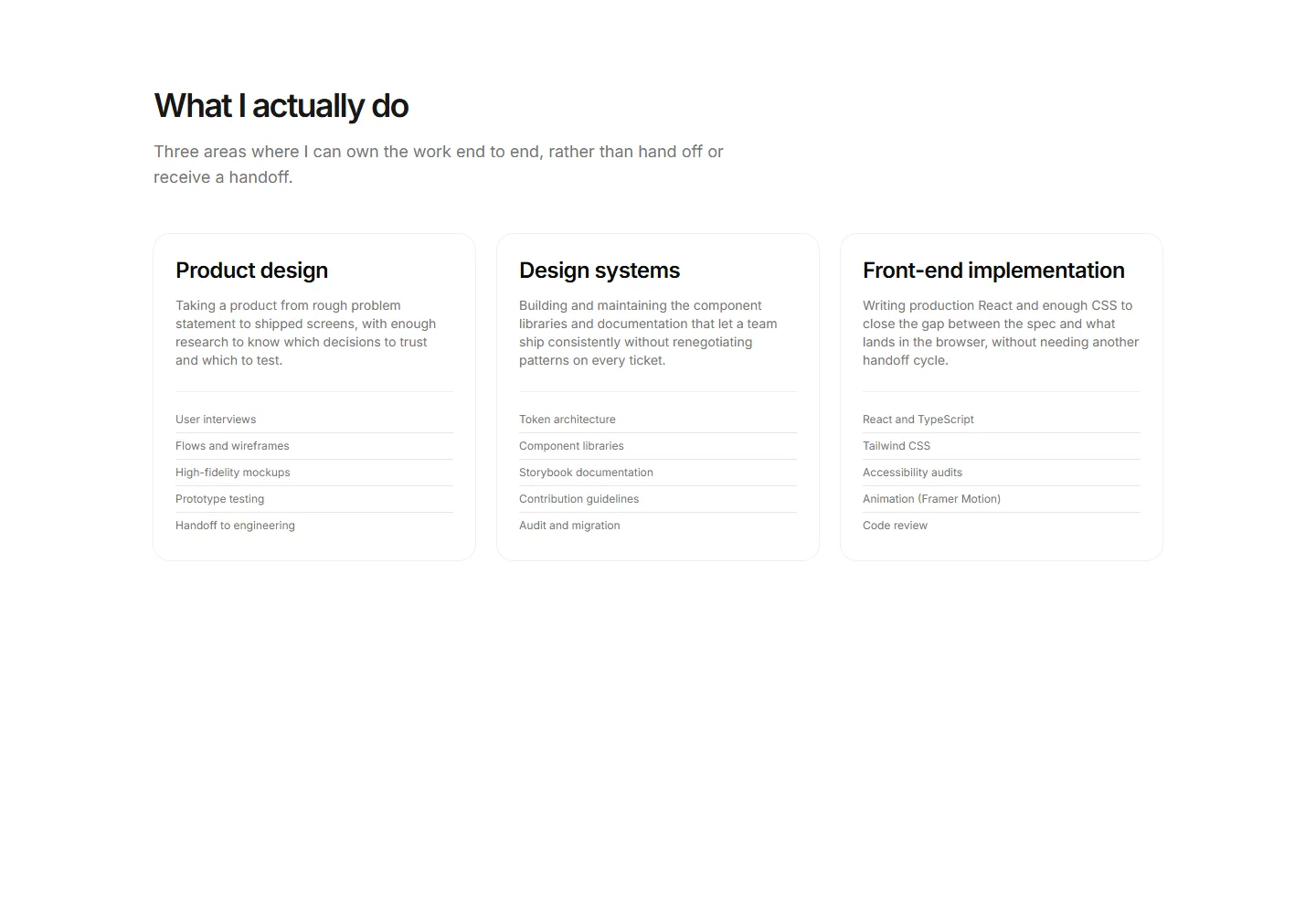
Three capability cards each with a title, a plain-language approach sentence, and a ruled method list covering App design, Design systems, and Front-end implementation.
A two-column card grid pairing four formal credentials with the practical skill chips each one produces so visitors see qualification and capability together.
A ruled list of core disciplines each with a plain-language description and a chip row of the supporting tools used.
Three equal discipline columns for a multi-discipline creative, each with a heading, a grounding sentence, and a ruled skill list covering Brand design, App design, and Creative direction.
A two-column expertise display with five div proficiency bars filled via theme tokens and plain-language level labels from Foundational to Fluent instead of percentages.
Three labeled columns of tool tiles covering Design, Development, and Collaboration, each tile showing a two-letter mark and the tool name.
A skills block listing four topics currently in progress, each with a reason and an honest status line showing where the learning stands.
A ruled list of skills with an honest level word per row and a one-sentence note that qualifies what the level includes and what it does not.
Twelve skills across three discipline columns each with a div bar and a word level from Foundational to Fluent rather than a percentage.
Four category cards in a two-column grid organizing specific skills by project phase from Discovery through Delivery for a senior app designer.
A heading and lede above a ruled list where each row pairs a skill with the project that proved it, its outcome, and the year.
A three-column grouped skills block with Design, Research, and Front-end category headings and bordered chip pills for a app designer or creative generalist.
A heading and lede above a bordered table pairing skill rows with three engagement columns, one filled dot per row marking lead, build, or refer.


