


Solid panel grid
Solid primary panel holding a heading and a six tile icon feature grid.
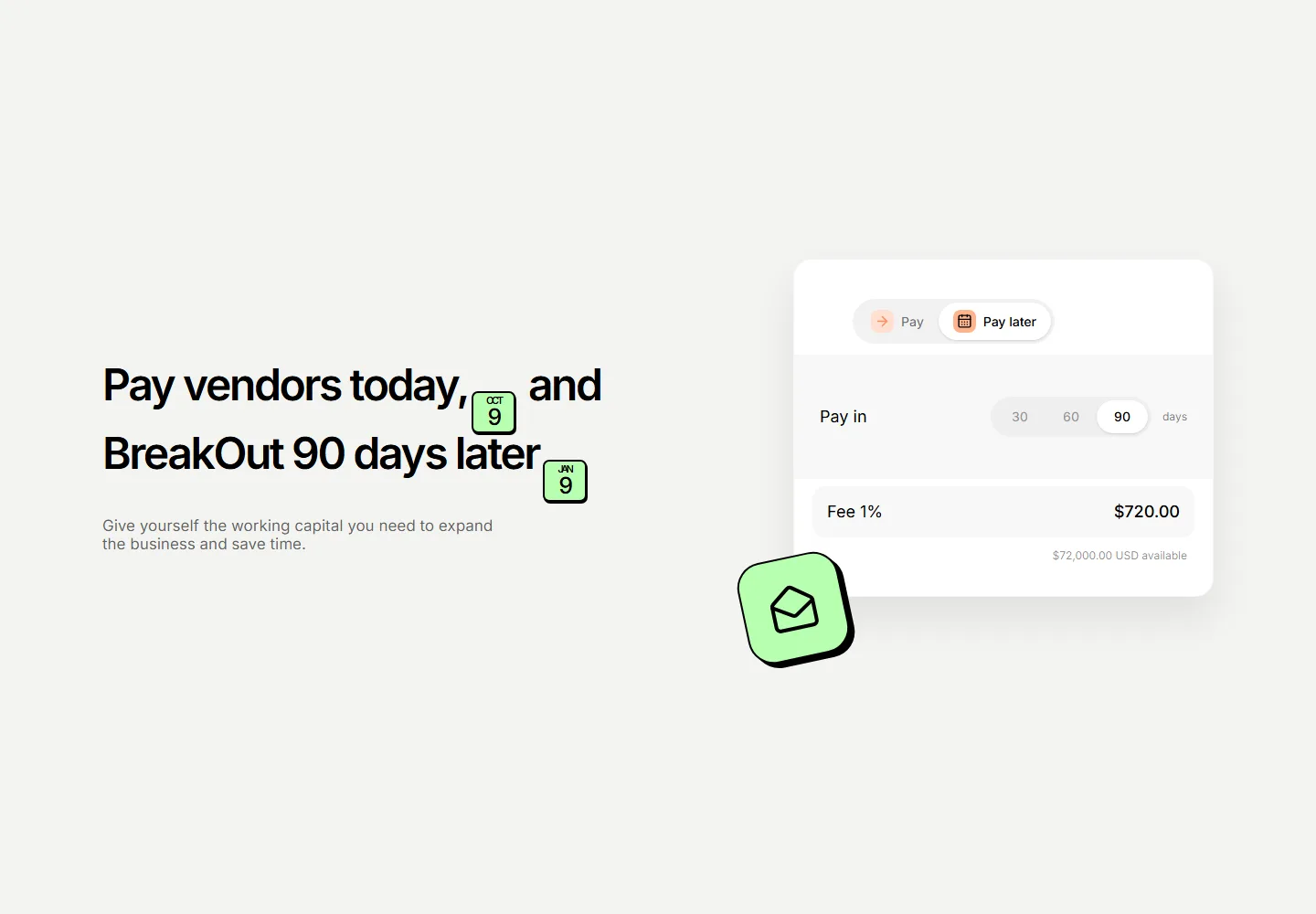
Split app feature presenting deferred vendor payments with date emphasis, term selection, available capital, and fee context.
Solid primary panel holding a heading and a six tile icon feature grid.
Heading and checklist beside a campaign window mockup with live progress bars.
Feature copy and a checklist beside an SVG automation flow with a trigger, condition, and branches.
Feature copy beside a two by two grid of mini stat cards with attribution notes.
Two stacked split panels pairing copy and checklists with app window mockups.
A tabbed feature showcase with pill triggers for plan, track, and ship views, each pairing copy and a checklist with an app panel mockup.
Icon feature grid capped by a divided band of three headline stats.
Three-panel AI app showcase with a working prompt demo, integration grid, model selection and a responsive feature checklist.
Feature cards that tilt in 3D as the cursor moves, each holding an icon, title, and copy. Adds depth to a landing page when you want highlights to feel tactile.
A tidy grid of feature cards, each with an icon, heading, and short description. Lays out several app capabilities at once for a clean overview section.
Stacked feature panels that expand on click to reveal detail and a paired visual. Lets visitors drill into one capability at a time without crowding the page.
A feature section styled as a chat thread, pairing message bubbles with copy. Built to show a messaging or support app talking in real conversation.


