


Stepped area chart
Active seats area chart using stepAfter type so each provisioning event reads as an instantaneous jump, not gradual growth.
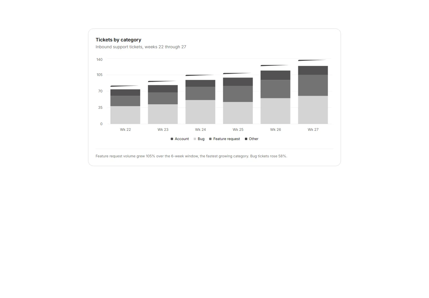
A stacked bar chart of support tickets by category over six weeks with a footnote naming the fastest growing series.
Active seats area chart using stepAfter type so each provisioning event reads as an instantaneous jump, not gradual growth.
Responsive portfolio chart cards with selectable periods, comparison series, accessible tooltips, legends, and change metrics.
Donut chart card paired with a two-column breakdown table, color keys, totals, and change values. The preview cycles sample data to demonstrate changing row counts and states.
API requests per day as two lines separating production and sandbox volume across a 14 day window.
MRR movement chart with floating bars for new business, expansion, and churn across a billing period.
Distinct active users per ISO week as a filled area over 12 weeks with a dashed quarter target reference line.
An area chart showing actuals with a muted 80% confidence band and a dashed projection tail for future months.
ScatterChart plotting accounts by usage score, monthly revenue, and seat count encoded as bubble size.
A card panel of five quarterly KPIs as bullet rows, each with qualitative range bands, a quarter to date measure bar, a target tick, and a shared axis.
A CSS grid heatmap of weekly cohort retention shaded by foreground opacity tokens with no chart library.
The funnel as horizontal bars with each rate against the prior stage, labeled.
Likert survey responses as diverging stacked bars around a center axis with a four segment legend and agree share per question.


