


Dumbbell latency chart
Dumbbell rows comparing p95 latency per endpoint before and after a release, with connector bars, paired dots, and an axis row.
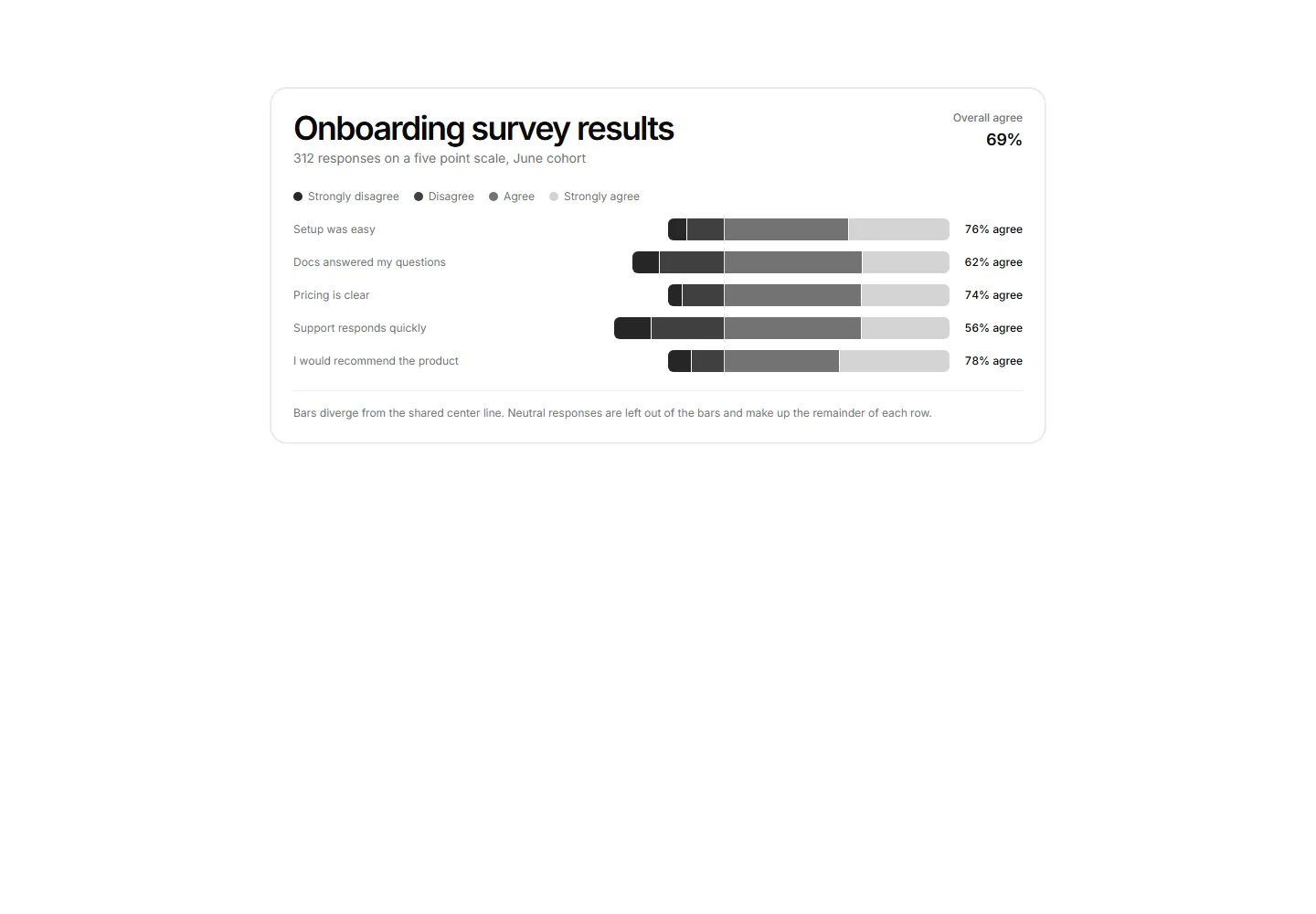
Likert survey responses as diverging stacked bars around a center axis with a four segment legend and agree share per question.
Dumbbell rows comparing p95 latency per endpoint before and after a release, with connector bars, paired dots, and an axis row.
A radial gauge showing a single SLA percentage with the value centred and the target threshold named in the footnote.
Feature usage grouped bar chart comparing this billing period against the previous across six categories with a shared legend.
CSS grid calendar heatmap shading daily activity by foreground opacity across a six month window.
A card panel charting API response times bucketed into 100 ms bins as a single distribution, with a p95 callout and a dashed reference line.
Horizontal bar chart ranking the top 6 pages by view count with inline value labels and a footnote naming the 3x lead of the top page.
API request latency as p50, p95, and p99 lines over 24 hourly points with ms axis formatting.
MRR movement as stacked bars with new and expansion above zero and contraction and churn below, last 6 months.
Three-series line chart tracking monthly active seats across Starter, Growth, and Enterprise plans with a legend and a footnote naming the September crossover.
A Pareto chart pairing error category bars sorted by volume with a cumulative share line on a second percentage axis.
A card panel charting monthly signups by acquisition channel as bars normalized to 100 percent, so the chart reads as share of mix over volume.
Donut chart of active workspaces by plan tier with a center total label and a four plan legend.


