


T-shaped skills
An asymmetric split pairing one deep discipline, unpacked as a ruled card of facets, with a breadth column of two labeled skill chip groups.
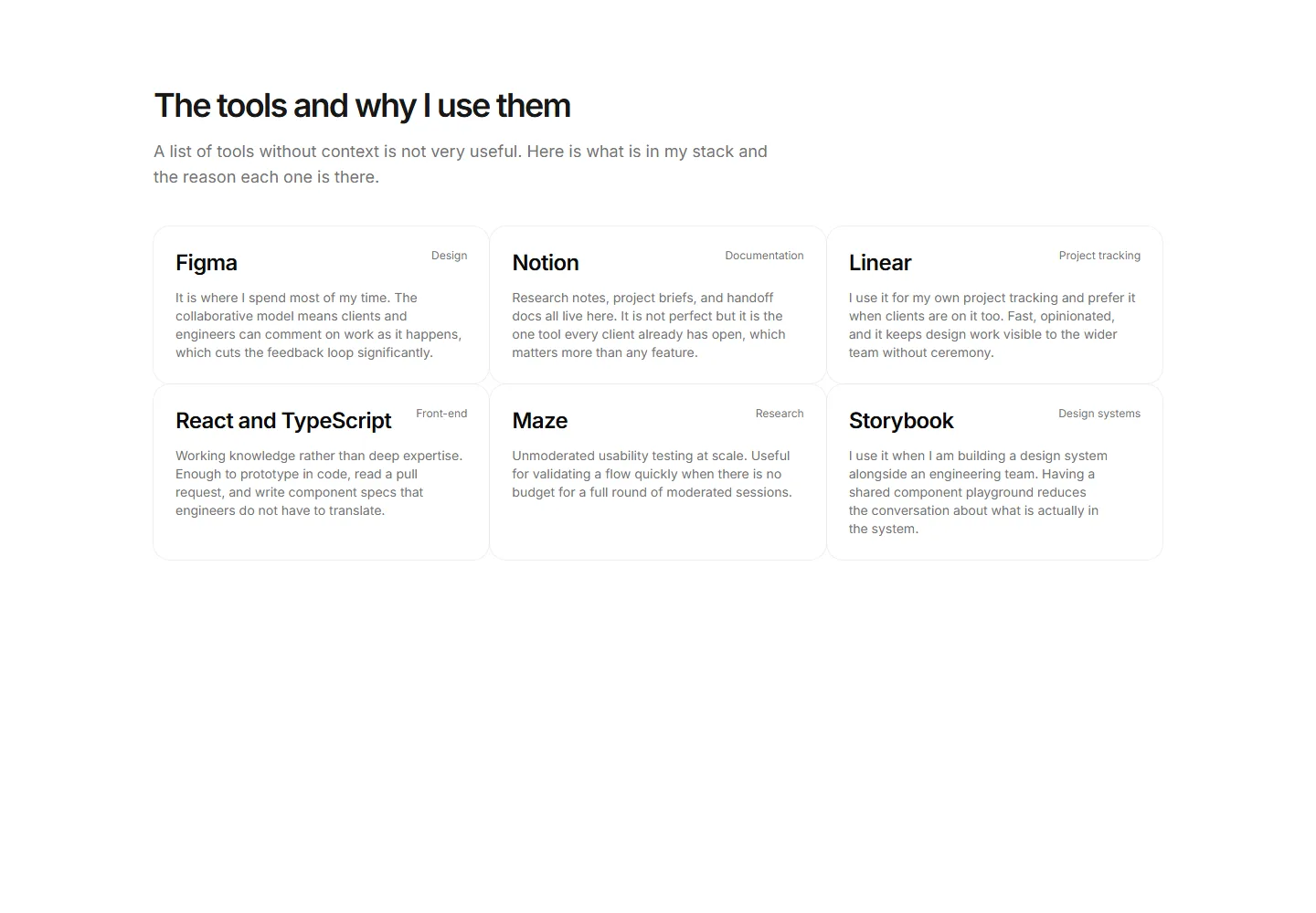
A three-column card grid showing six core tools each paired with a sentence explaining why it is in the stack rather than an alternative.
An asymmetric split pairing one deep discipline, unpacked as a ruled card of facets, with a breadth column of two labeled skill chip groups.
A bordered horizontal strip showing a full-stack developer technology choices in three labeled rows: Frontend, Backend, and Infrastructure.
A four-group grid of tool tiles with two-letter mark badges covering Design, Development, Research, and Delivery tools used day to day.
A static wrap strip of twelve tool chips each showing a name and a one-word category, giving an at-a-glance view of the full toolkit.
A two-column skills layout grouping chips by project phase across Research, Design, Systems, and Delivery columns.
A ruled list of six daily tools each paired with one sentence explaining why that tool earned its place over the alternatives.
A wrapped chip cloud that renders core disciplines larger and bolder so the primary expertise registers at a glance.
Three capability cards each with a title, a plain-language approach sentence, and a ruled method list covering App design, Design systems, and Front-end implementation.
A two-column card grid pairing four formal credentials with the practical skill chips each one produces so visitors see qualification and capability together.
A ruled list of core disciplines each with a plain-language description and a chip row of the supporting tools used.
Three equal discipline columns for a multi-discipline creative, each with a heading, a grounding sentence, and a ruled skill list covering Brand design, App design, and Creative direction.
A two-column expertise display with five div proficiency bars filled via theme tokens and plain-language level labels from Foundational to Fluent instead of percentages.


