


Compact navigation
A slim 12-unit header with a name mark on the left and three minimal text links on the right, nothing else.
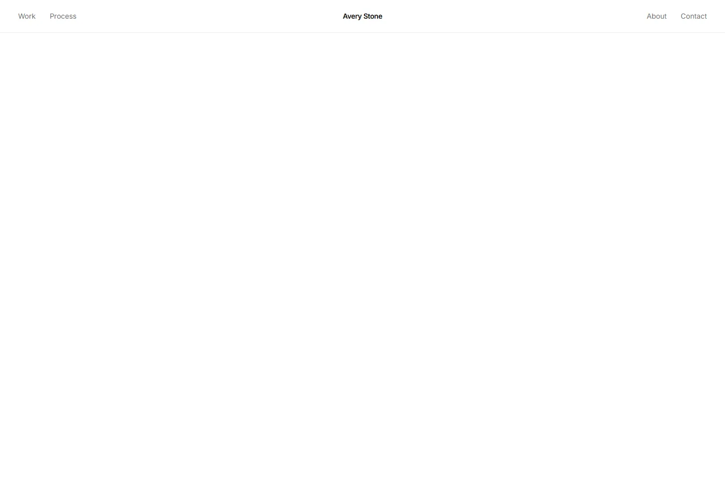
An editorial header with the name mark pinned to the absolute center and two nav links split symmetrically on each side.
A slim 12-unit header with a name mark on the left and three minimal text links on the right, nothing else.
Full width header where the name mark and each page link occupy their own border separated cell, ending in a solid inverse contact cell.
A navbar with the name mark centered and two navigation links flanking it on each side, plus a contact button on the far right.
A desktop header shown with its Work menu open, a full width panel laying out three category cards with thumbnails, counts, and a footer row.
A minimal personal-site header with the name mark on the left and three nav links on the right, nothing else.
A mobile-first header shown in its open-menu state with four large stacked links and zero-padded index numbers.
A navbar with name, centred links, and a pulsing emerald dot beside an availability month label on the right.
A conversion header with the name mark, three nav links, and a primary Get in touch button on the right.
Header with a name mark on the left, centered page links, and a location readout showing the city and a local time label on the right.
A site header with a name mark and nav links on the left and a download CV button on the right for portfolios where recruiters need direct resume access.
A connected header with the name mark and nav links on the left and a row of GitHub, LinkedIn, and Instagram icon links on the right.
A navbar with the name mark on the left, four nav links in the center, and a static sun and moon theme toggle button on the right.


