


Horizontal blog carousel
A horizontal carousel of blog cards that scrolls sideways. Use it to preview recent posts in a tidy row without taking up much vertical space.
A responsive grid of blog cards with cover image, title, and excerpt. The standard layout for browsing many articles on a writing index page.
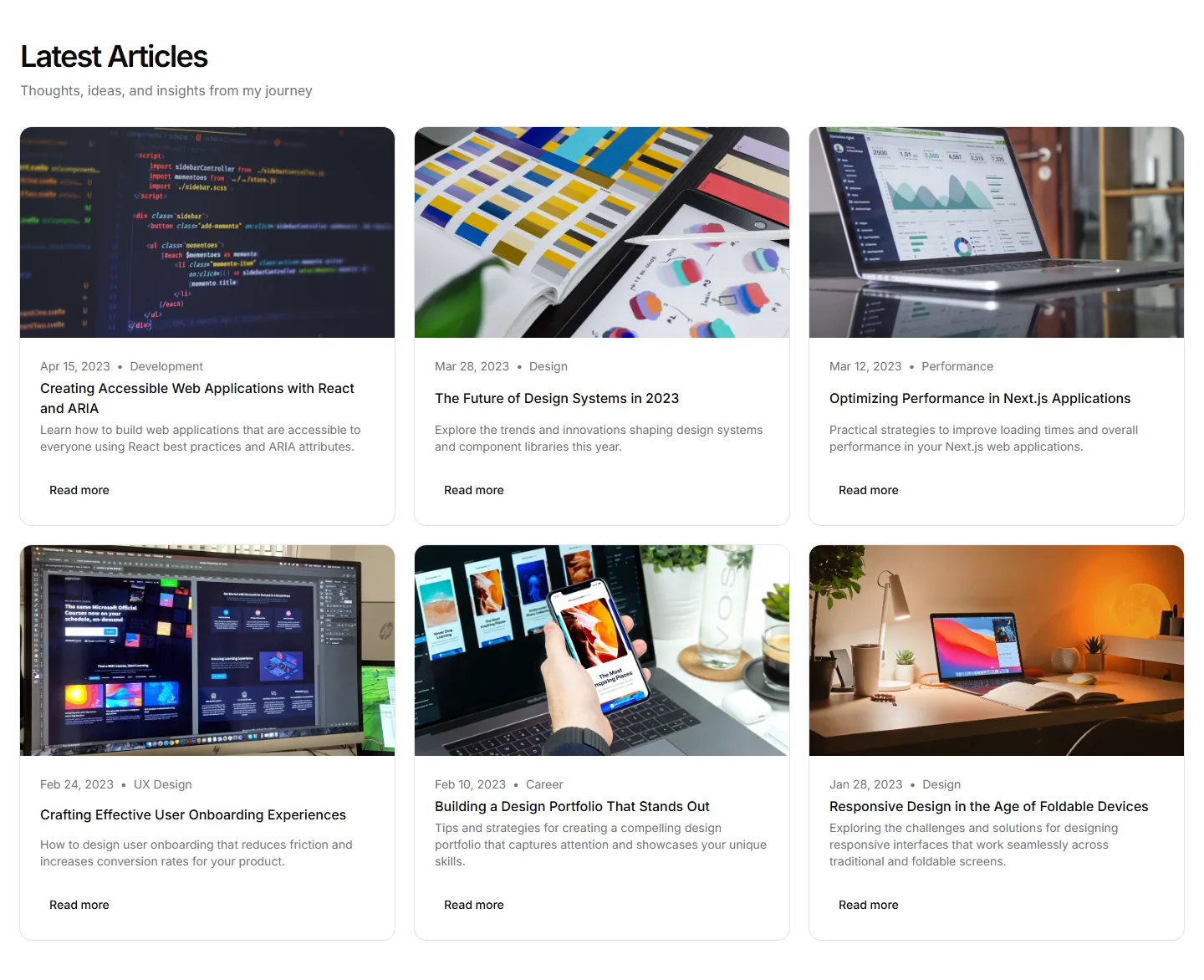
A horizontal carousel of blog cards that scrolls sideways. Use it to preview recent posts in a tidy row without taking up much vertical space.
A masonry grid of article cards with varied heights for a dynamic feel. Fits posts that mix tall images with short text on a writing showcase.
A plain text list of post titles with publish dates beside each one. Use it when you want a fast, distraction free archive of all your writing.
A list that leads with one large featured article followed by smaller entries. Use it to spotlight your best post while listing recent writing.
A bordered card holding a headline, short pitch, and email field. Use it as a standalone callout inviting visitors to join your mailing list.
An email field built into the site footer beside links and details. Captures subscribers at the bottom of every page without a dedicated section.
A modal that surfaces an email field over the page, often on exit or after a delay. Use it to catch visitors before they leave your portfolio.
A single row with an email input and a subscribe button. Slots into any section when you want a quick, low friction way to gather addresses.
A two column section with descriptive copy beside the signup form. Explains what subscribers get while keeping the email field clearly in view.
A prominent card spotlighting one downloadable resource with a cover, summary, and button. Use it to push a flagship guide or template to visitors.
A download offer behind a short email form so visitors trade contact details for the file. Use it to capture leads while sharing a guide or kit.
A compact callout that slots into running text to point readers at a related file. Use it to surface a download right where it stays relevant.


