


Modern pricing section
A contemporary pricing section with bold cards, soft shadows, and accent gradients. Use it to give a polished, current feel to a app or SaaS page.
A pared back pricing layout with generous spacing, plain type, and one clear price. Use it when a single plan or clean brand needs no visual clutter.
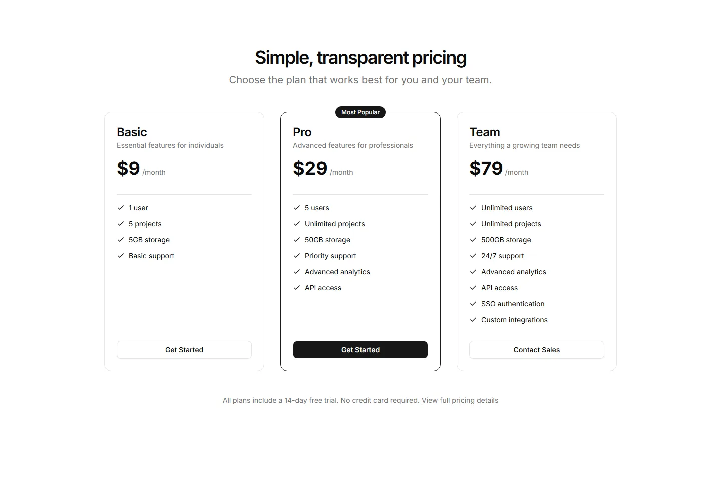
A contemporary pricing section with bold cards, soft shadows, and accent gradients. Use it to give a polished, current feel to a app or SaaS page.
A pricing section with promotional banners and limited time discounts on each plan. Use it for holiday sales, launches, and campaigns that push urgency.
A clean pricing section showing a few plans with price, features, and a button each. Use it when you want fast comprehension without extra decoration.
A pricing layout that stacks plan cards vertically for narrow columns and phones. Use it on mobile first pages or sidebars where width is limited.
A pricing section that pairs plan cards with customer quotes and logos. Use it to add social proof right where buyers weigh price and decide to commit.
A pricing section with a monthly and yearly switch that updates every plan price. Use it to show annual savings and let buyers pick a billing cycle fast.
Two plan cards under a monthly and annual switch that updates prices with a savings badge.
A split pricing section pairing a base plan card and feature checklist with a stack of priced extras and a hairline estimated total row.
Three slim tiers with a price and one deciding sentence each, no feature lists.
A full feature matrix for three plans with pricing and CTAs in the column heads, grouped feature rows, and a tinted band on the popular plan.
Four prepaid credit pack cards with one time prices and per credit rates, above three notes on expiry, team sharing, and automatic top ups.
The same plan in four currencies with purchasing power discounts published openly.


