


Compact overview
A tight item layout that fits the image, price, options, and buy button above the fold. Built for small screens and quick mobile purchases.
A classic item page with a large image on the left, title, price, variant options, and add to cart on the right. Familiar layout shoppers expect.
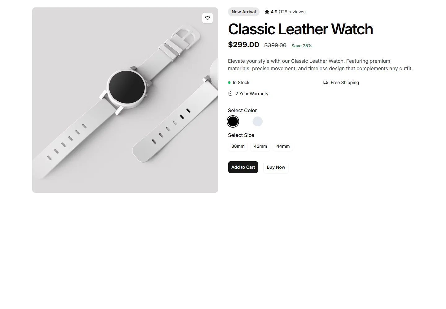
A tight item layout that fits the image, price, options, and buy button above the fold. Built for small screens and quick mobile purchases.
A item page led by a multi image gallery with thumbnails beside the details. Lets shoppers study every angle before they add the item to cart.
A full bleed item page with edge to edge imagery, floating details, and a sticky buy bar. Best for premium goods that sell on visual impact.
A pared back item page with one clean image, title, price, and a single buy button. Keeps focus on the item for simple, low clutter catalogs.
A contemporary item page mixing a bold image grid, accent typography, and clear pricing. Suits fashion and lifestyle brands that want a fresh look.
Three real buying questions laid out as correspondence, the quoted question and sender on the left, the honest reply and staffer on the right.
Accordion of five honest questions asked before checkout, first item opened, each answer printed even where it costs the sale.
Four ruled stage columns walk week one through year five of canvas break in, closed by a straight note on the return window.
Two mono ledgers show the decade math at $21.50 a year versus $36, caveats printed beside the sums.
A verdict table for five checkout add ons, each row naming the item and price, a badge, and an honest reason to buy or skip.
Two framed colorway panels side by side, each with a swatch, share stat, and honest wear rows, closed by an exchange ledger note.
Three numbered honest questions before the buy, boredom named, the bench ready to talk you out of it.


