


Winter item promo
Full-bleed seasonal item promotion with licensed winter imagery, legible responsive overlays, item details, and purchase actions.
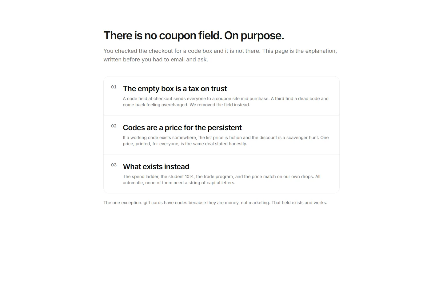
The missing code box defended in three arguments, with the gift card exception.
Full-bleed seasonal item promotion with licensed winter imagery, legible responsive overlays, item details, and purchase actions.
A centered promo with an icon, headline, and supporting copy. Highlights a single offer or shipping perk in the middle of a store landing page.
A centered promo paired with a tidy grid of item images. Showcases a curated collection or a seasonal lineup right on your shop homepage.
A clean centered promo with a headline, short message, and button. Drop it onto any store page to push a sale, a discount code, or a new arrival.
A promo block with a live countdown timer, headline, and call to action. Builds urgency around flash sales and limited time offers that expire soon.
A testimonial promo with a soft fading background and a customer quote. Builds trust on a item page while reinforcing the offer you are running.
A full width promo with oversized type and a clear button. Commands attention across the whole page for a headline campaign or a seasonal launch.
A promo with copy on one side and a item image alongside it. Pairs your offer with a visual so shoppers see exactly what is on sale right now.
A split promo with a large image filling one half and an offer on the other. Frames a hero item next to a discount and a clear, single button.
A promo arranged as several cards in columns, each holding its own offer. Presents multiple deals or categories side by side on one store page.
A slim promo banner with a short message and a link. Sits at the top of a store to announce free shipping, a running sale, or a fresh discount code.
A promo split into two panels, each holding a separate offer and button. Lets shoppers pick between two competing deals within one store section.


